CyperX.dev
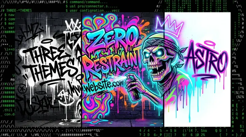
Personal site. Three themes. Zero restraint.
Neo-brutalist personal site built with Astro. Dark, light, and extreme theme variants. Scroll effects, glitch aesthetics, liquid shard layouts.
This is the site you're on right now. Three themes, zero compromise, and a deliberate rejection of every safe design choice in the developer portfolio playbook.
Why three themes
Most sites pick a palette and call it done. I wanted the design itself to be a statement — dark for readability, light for accessibility, and extreme for the people who want their screen to feel like it's alive. Each theme isn't just a color swap. The extreme variant has glitch effects, fractal backgrounds, vibrating text, and clip-path polygon layouts that make the page feel like it's being rendered by a machine that's slightly losing its mind. The dark theme is clean and terminal-native. The light theme is editorial and magazine-influenced. Three different design languages coexisting in one codebase.
The decision to build three wasn't about feature creep — it was about proving that Astro's static architecture could handle radically different visual identities without any JavaScript framework overhead. CSS classes on the root element, a tiny theme toggle script, and everything else is just HTML and CSS doing what they were designed to do.
Design process
The initial concepts were generated in Google Stitch — Anthropic's AI-assisted design tool. Stitch is good at establishing visual direction quickly, but its output isn't production-ready. The shard clip-paths, the liquid polygon layouts, the glitch keyframe animations — all of that was hand-written in Tailwind utilities and custom CSS. Stitch gave me the mood. I gave it the engineering.
The clip-path polygons are what give the site its distinctive angular aesthetic. Instead of rounded corners and soft gradients, elements are sliced at aggressive angles using clip-path: polygon(). Combined with the neon color palette (#39FF14, #FF51FA, #AC89FF), it creates something that looks like a terminal interface designed by someone who grew up on cyberpunk anime.
How it works
Content is static. Blog posts and project pages are Astro dynamic routes pulling from TypeScript data files and markdown content collections. Scroll animations use IntersectionObserver — no scroll libraries, no dependencies, just the browser API watching elements enter the viewport and applying CSS transitions. Build output is pure HTML, CSS, and a minimal JS theme toggle.
Deploys to Cloudflare Pages in under a minute. Push to main, Cloudflare builds it, the site is live. No Docker, no CI pipeline, no infrastructure to manage. Astro's static output is tiny — the entire site compresses to almost nothing.
Why Astro
Zero JavaScript by default. Islands architecture means I opt in to interactivity only where I need it (the theme toggle). Everything else is server-rendered at build time. For a site that's fundamentally about presenting content with aggressive styling, this is the perfect framework. No hydration tax. No client-side routing overhead. Just fast, static pages that load instantly.
Current status
Always building. This site will never be "done" — it grows every time I ship a new project or write something worth posting. The architecture is stable and the content keeps expanding.
- Astro — Static site generator with islands architecture. Zero JS by default.
- Tailwind — Utility CSS for layout, spacing, and responsive design. Custom CSS handles the weird stuff Tailwind can't.
- TypeScript — Type-safe data files and content schemas.
- Cloudflare Pages — Hosting and CDN. Sub-minute deploys from git push.